/ DESIGN PHILOSOPHY .
Here you can view my designs in chronological order, most of which are in progress but still carry enough design elements to give a sense of what it'll turn out like.
FORMULA SAE
CAR LIVERY & TEAM LOGO DESIGN
One of my duties at Formula Buckeyes SAE is to redesign the car livery and redesigning team logo.
TEAM LOGO

You can see the initial design brainstorming below. The body in design 2 and 3 were composed of the letters ‘F’ and ‘B’ to signify Formula Buckeyes. I tried to make F look like the front half of a Formula 1 car and B the real half.
These designs were interesting but we needed words to convey the team name through logo. So I did some more brainstorming and finally came up with this:

CAR LIVERY DESIGN
For the livery I wanted to bring back the essence of old school Formula 1 livery designs. This meant broad, confident sections where each color dominated the design while working cohesively to produce an effect that was both soothing and badass.

Side View

Front | Top 3/4 view
Below is the first design I came up with but it felt too gentle so I didn’t go ahead with it:


IRON CAR

IRON CAR MARK II
Iron Man is one of my favorite Marvel characters and the designs of his suits are quite aggressive. However, it felt that none of the cars he has really signify his character. It got me wondering what it would be like if he had his own car, a car that would match his suit, instead of the Audi R8 he drives.

Mark I
This was the original concept, based on the helmet design of his suit. I was satisfied when I first made it about 3 years ago but it started looking a bit weird with every time I looked back at it.

Mark II design lines brainstorm
This is the successor. Sharper, more smooth lines, and overall more like a car than a squashed Iron Man helmet with a bumper added to it.
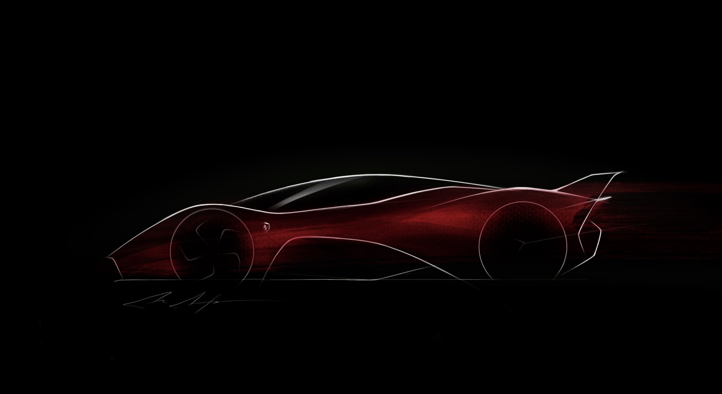
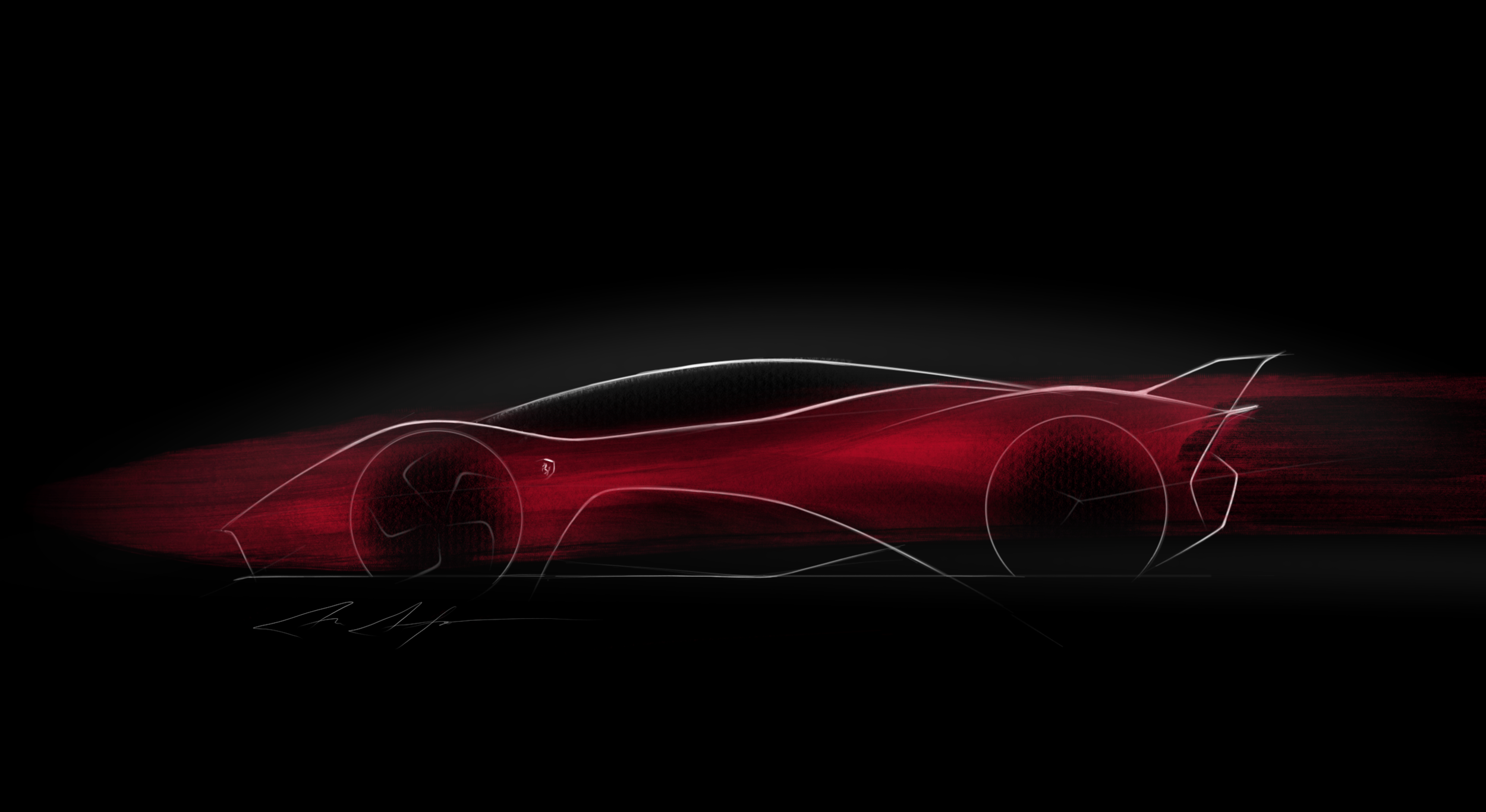
Ferrari Lines

The lines that form the shape of a Ferrari are pretty iconic. I specially like how the LaFerrari (aka the F-150) follows them to Enzo's core. I sat down to design a car for Ferrari, and this is what it looked like:

It looked decent, so I tried giving it some materiality.

Attempt 1 - Basic gloss finish

Attempt 2 - A more textured finish with more curve detail and shading
Then experimented with some colors: